Monday, April 28, 2008

Timelines in Your Zotero Bibliography

I have previously written about Zotero. I like it very much as a bibliographic manager except for one thing: the fact that your collections are linked to a particular computer rather than shared across a network. I recognize that many people do most of their work from one computer and this isn't really a problem. I also know that exporting and importing citations into Zotero isn't hard. But since I work regularly from a laptop that is too ancient to have reliable Internet access as well as on a collection of different computers across campus and at home, Zotero hasn't proven to be as big a deal for me as I imagine it will be when version 2.0 comes out. This will allow you to not only access your collection from anywhere online but also to share your collections with others, create RSS feeds from them, and more. Until then, I'm going to stick with Endnote. (Yes, I recognize that EndNote doesn't play nice with sharing citations without a subscription to EndNote Web [I'm not even sure that Emory has a subscription].)

But here's what I'm interested in today: Zotero has added a SIMILE Timeline feature. You can read about it here. (Thanks, JBJ!) The timeline is fairly simple: it is designed to show you when the materials in your collection were either published (publication date), added (when you first added them to your Zotero collection), or modified (the date you last updated the entry). You can also highlight different items based on words in their title, filter entries by a keyword, just to a particular year on the timeline, or adjust the units of the three timeline bands.
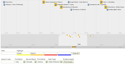


The timeline appears in your browser, which is where Zotero lives. It does not at the moment, however, come with a stable URL which would allow you to share it with others. Instead, all the information (as is the case with all of Zotero) lives on your computer. Perhaps this will change when the new version of Zotero emerges and citations begin living on a web server rather than a small file on your hard drive.

Something else that I would like to see is the ability to highlight items based on terms beyond title words. At the moment, if I have a term in the "notes" field for a book, the book will not be highlighted when I use that term in one of the timeline's highlight boxes. Since terms that I associate with articles or books are not always (or even frequently) part of their title, the highlighting feature doesn't really serve the purpose that I think one would want for it: to show relationships between objects that are not immediately obvious.

Then again, one might ask whether having a timeline of your bibliography is the best place to reveal these relationships. Zotero has a "tag" feature, and if you've been diligent in assigning them, you can sort your collection within Zotero by those tags, without dealing with the timeline. A bigger question is about the whole implementation of a timeline in Zotero: does one really needs to visualize bibliographic data by date? I don't think that it's something that I will be using frequently. But then again, my work is not as date sensitive as that of people in the sciences or social sciences. My timeline works best when viewed by years and decades rather than months. Others would likely benefit from seeing how sources follow one another.

The larger benefit is something that I've been interested in throughout this year: the increasing ability to visualize data that is made possible by web 2.0 tools. I can't prove to you that having your bibliography in a timeline will lead to new ways to think about the sources or the datasets that they contain. But there's no reason to think that having this option wouldn't be of benefit. Just like Moretti's Graphs, Maps, Trees, you don't know what you can learn from a quantitative model (or quantitative-esque as far as Zotero goes) until you build it and spend some time looking at it. Perhaps if I added every source from Discourse Networks, I would learn something new about the shift in read/write technologies from 1800 to 1900. Or perhaps I could see where Kittler perhaps missed a crucial decade's worth of sources. In any case, something like the Zotero timeline is a tool to accomplish this.

P.S. As long as I'm passing along suggestions, it would be really amazing to see Zotero use SIMILE's Exhibit script in conjunction with Timeline, which would potentially allow the visualization of data to incorporate relationships between sources, their notes, tags, and more.

Thursday, April 24, 2008

Build Your Own Social Network

Despite my best efforts, I'm frequently behind the curve on web tools and platforms. Today I came across two different tools that essentially allow you to roll your own social network: ning and grou.ps. The idea is that rather than using a forum or wiki architecture, which are, respectively, either painful limited in what they can do or more complicated than the average user can handle, you have a WYSIWYG editor to compile your own Web 2.0 community.

To what extent are these something more than just a prettier forum? I'm not really sure yet. I'm thinking I'll have to play with these over the next few weeks. Anyone else want to play along?

Web 2.0 and Education

Wayne recently sent me a link to K-12 Technology Specialist Steve Hargadon's blog. A post at the beginning of March (sorry for being slow) suggests that Web 2.0 is the future of education. Hargadon is nothing if not effusive about his subject. Several commenters question the reality of his vision, in particular whether it will be possible to educate educators to make use of Web 2.0 tools when they are already busy and/or comfortable with their current levels of technology. I think they are right to make these observations, but let me just draw on two or three points of Hargadon's that I find interesting.
  1. Web 2.0 is primarily about publishing. Whereas the early web was oriented toward information delivery, the current iteration emphasizes the production of information by its participants. Create and remix are the orders of the day. We can take advantage of this by asking our students to participate in the assembly and creation of knowledge that is easily accessible to others. Students have in a sense always been creating, but publishing raises the stakes. (One of Hargadon's commentators correctly notes that the read/write opposition between Web 1.0 and 2.0 doesn't really hold because people were participating in email, chat rooms, etc. in the former. The difference, as I see it, is in the publishing of content so that third parties can read it.)
  2. The ease of publishing in a Web 2.0 environment means that we are faced with increasing amounts of information. Hargadon's proposed remedy?
    ...Produce more content. Because it is in the act of our becoming a creator that our relationship with content changes, and we become more engaged and more capable at the same time. In a world of overwhelming content, we must swim with the current.
    This is a noble idea, but I'm not sure that it holds water. My writing this blog doesn't necessarily mean that I have a better idea of what information is out there. I extract things that I come across that are useful and share my observations on what I've been working on. But that doesn't help me manage everything I don't have time for. Perhaps what it does, however, is give me a place to articulate what I find to be valuable. Pointing it out to others. But does this all boil down to just another Digg-like application? Where things get filtered out by mass aggregation? That doesn't seem all that different from the systems we already have in place.
  3. "The expert is giving way to the collaborator." I'm of the opinion that there will always be a need for experts. After all, having an expert teach you something is quite frequently the fastest means of information transfer. And at ECIT, we are all about best practices. But at the same time, I believe that collaboration will increase in importance within the classroom. And it won't just be the students collaborating with one another, but them doing so with the teacher/professor. It might look something like a class taught by Sander Gilman in Emory's ILA during the 2006-2007 school year, where the undergrads and grad students actually wrote a book:
    The end product of the course will be a collaborative volume on the history of dieting which has been commissioned by a major publisher. This course will demand real research, real writing, and will have a real product.
    The English Department has been making grants available to faculty members and grad students who want to co-author an article. Although these endeavors don't necessarily employ Web 2.0 technologies, they do capture the Web 2.0 mentality. What's more, they provide a possibile answer to the comments to Hargadon's original post who wonder how they can get teachers to learn new technologies: offer a concrete reward that has nothing to do with improving one's teaching.
So. I'm interested in hearing what others think about these points. Do social networking applications change the dynamic in a classroom, regardless of whether the class is using them? Do students coming into college today expect something different than they did when I arrived as a freshmen in 1995? How can we collaborate with our students?

Friday, April 18, 2008

A different approach to mapping

So although I've been dusting off my Google Earth skills a bit, this is going to go in a completely different direction. Last week, Shawn McCauley wrote about a new mindmapping tool--bubbl.us--on the English department blog. Mindmapping is perhaps a fancy way to say "outlining." But it's an exercise that many of us have used for our own work or taught to our classes as a way to begin a project. It can also be a useful brainstorming activity.

Shawn provides a good summary of the features of bubbl.us and also speculates on the classroom value of bubbl.us:
I can see bubbl having a variety of pedagogical uses, both individually and collaboratively, both inside and outside the classroom. From teaching brainstorming in composition courses, to having students collaboratively trace the genealogy of the novel, to providing a graphic representation of intertexuality or patronage networks to accompany a lecture or in-class discussion, potential mapplications of bubbl abound.

Finally, Shawn mentions two other mindmapping tools: Mindmeister and Mindomo as objects worth playing with if we were so inclined.

I hadn't previously played with mindmapping tools but checked out bubbl.us immediately as it seemed to be something more exciting than revising the dissertation chapter I was working on. Using bubbl.us proved so easy and fun that I began using it to collaborate with Rachel Bowser on a conference panel proposal we had been kicking around. After spending some time with bubbl.us, I decided that I would check out Mindmeister and Mindomo as well. In the past week, I've made several different mindmaps in each of the tools, and I think I have a good grasp on the advantages and disadvantages of each of them.

These are all useful tools that could be put to interesting use in the classroom, for group work, or for individual (student or professor) organization. They are all free (although two have subscription options) and are web-based so there is no need to install new software and your work is available wherever you can connect to the Internet. Generally speaking, Mindomo and Mindmeister are very similar to one another. They both organize materials in a tree structure. They're very orderly and allow you to collapse different elements of your tree to reduce the complexity of what you've built. And some of these maps can get very complex, as you can see from this mindmap of dermatology on Mindmeister made by Daniel Nygren. After playing with each of them extensively, I'd have to say that Mindomo is the definitely the more powerful of the two, but it also has a steeper learning curve. Mindmeister lacks some of the features of Mindomo, but the trade off might be worth it because its ease of use perhaps makes it more appropriate for the classroom. You can see example maps I made in both Mindomo and Mindmeister for people whom Rachel and I needed to contact about our call for papers.

bubbl.us is not as polished as the other two platforms, but there's a reason that I've spent most of my time with it. It's the easiest and the most fun of the three. Rather than using a tree structure, which is fairly rigid in how you can position different elements in relation to one another, bubbl.us allows you to position its topics and subtopics anywhere on the map that you'd like. There are some features missing from it that are really important, like the ability to add hyperlinks or images to your bubbles. But on the other hand, it appears to not even be in Beta yet--although still open to public use. It will be interesting to see where its development goes from here. (Note to Google: buy this site now!)

I could go on and on about the different advantages and disadvantages of the three different platforms (and you may think that I already have). But I've decided to use bubbl.us to summarize all of this for you.


If that's a bit small for you to be able to browse the information effectively--and I suspect that it will be, although the zoom buttons in the upper left corner can help--then you can browse a full-sized version here. Unfortunately, you can't drag the bubbles around or start making new connections between things on my map. So I'll just recommend that you sign up for a bubbl.us account (or one of the others, if you prefer their looks) and start playing.

Friday, April 11, 2008

Apple takes a step backward

Last fall, when ECIT taught the Technology, Literacy, and Curriculum (TLC) workshop in conjunction with the English department, I was asked to conduct some assessments of the course. I wasn't surprised that all the participants had learned new things and that they anticipated using the various technologies and techniques we discussed in their upcoming courses. But what did surprise me was out of all the subjects we covered in 16+ hours, the one that students found most appealing was the demonstration on how to give presentations from their iPods.

This is an admittedly easy thing to do. Simply connect an Apple AV cable to your iPod and plug the other end into RCA connections on your TV.
Then you can simply play a slide show or videos on the TV. No need to worry about PowerPoint or bringing a flash drive to class. (ECIT always recommends, by the way, that if possible you do bring a second copy of your presentation in a different format so you have a backup route for showing something.) You can now give a lecture with slides or video and not worry about any equipment besides your iPod, which most people always have with them.

Of course, Apple was tricky with their cables. They changed the wiring inside the iPod so that if you used a regular RCA cables that come with, say, your digital camera or that cost less than $5 at an electronics store it wouldn't output correctly. However, if you played around long enough, you could eventually discover that if you plugged the red cable into the yellow jack, the yellow cable into the white jack, and the white cable into the red jack, you had a working solution. Even if you didn't want to play around, Apple's cables, which had the right color scheme only cost $20.

All this changed last September, when Apple introduced the newest line of iPods: the Classic, Touch, and newest version of the Nano. Instead of outputting through the headphone jack with regular or Apple-branded RCA cables, to output your signal to TV all of these new iPods require you to have a cable or a dock with an Apple authentication chip. This chip is available in new cables that Apple has released and that plug, not into the headphone jack as on the 5th Generation iPod, but through the iPod dock connector. Importantly, the dock connector is, like the authentication chip, a design that Apple holds a patent on as opposed to headphone jacks. Okay, you say. That sounds less than ideal. How much will I have to pay for this magical iPod cable? Hear's the really egregious part: $50.

Perhaps this isn't news. In fact, ilounge.com, one iPod enthusiast website, covered this subject two days after the most recent iPods were announced. But I came up against this problem last week when teaching a class on iPods and enhanced podcasts for postdocs in Emory's FIRST program. We had some trouble getting the TV out to work in part because I wasn't aware that the postdocs' iPod Classics used differently technology than the previous generation.

One lesson to learn from this is to make sure you have tested all your technology before your class begins. It's never good to have the guy who is teaching you how to use an iPod be incapable of making it work. But the second lesson is that Apple has made it that much more difficult for us to use in the classroom what was the easiest and, according to the students, the best thing that we taught in TLC. Sure, I suppose you can say that we just need to go buy another cable. But the reality is that for graduate students $50 can be a significant cost. It's even significant if Emory or another institution is paying for the cables. Especially when one considers that 80 GB iPods cost $250, the purchase of the cable amounts to a 20% price increase in order to use an advertised feature of the iPod.

Apple's made a name for itself for being the company the makes products you go just plug in and start working with, and ECIT has touted iPods for being a tool you can just plug in and start teaching with. It's too bad that plugging in costs you an extra $50 now.

Thursday, April 3, 2008

Google Timeline Gadget

I'm continuing to work on my tutorial for building your own timelines. I'm getting very close to having a final version of something I think can be useful for even those who have no experience writing HTML. If you've been following my work on this topic at all over the last six months or so, you'll know that I will suggest you host your data within a Google Docs spreadsheet. Well, a recent update to Google Docs may make the whole process even easier than that which I have come up with for the moment.

What's been added to spreadsheets is the ability to push your data through a "gadget." And one of those gadgets just happens to be a timeline gadget that is based on the Timeline code written by SIMILE. You can read about how to use the gadget here, but it is very simple:
  1. Set up your spreadsheet with the appropriately titled columns.
  2. Click on the gadget button that is in between the "Wrap text" and "Merge across" options.
  3. Scroll down and select "Timeline Gadget."
You then have a number of options. You need to set the range of cells for the gadget to read. Then you can choose the units for the upper and lower bands (week, months, or years are the only choices). You can also set the width of these units and the background colors of the two different timeline bands. All in all, it's a very nice system.

There's just one problem...I haven't been able to get it to work. I keep getting an error message that suggests that I haven't titled all my columns correctly. After spending all this time working with Timeline and its scripts, however, I'm pretty sure that I've got that part right. I'm pursuing help with the powers that be to see if I can figure out how to get this working.

In any case, here's the part where I give you the positive and negatives to this approach and which will inevitably suggest that my chosen approach is particularly suited to what I want to achieve. On the plus side, it should be super easy to use. The gadget gets around your having to write an HTML side to a timeline. You can still share your spreadsheet with multiple people easily and thus have the database/wiki like feel to building and editing the timeline. Finally, the gadget includes an option that makes it easy to embed it in another web page or to include it in your iGoogle page. This means that you could build the timeline within a spreadsheet, but still place it within a page of your own design.

The disadvantages at the moment include the inability to customize the timeline as much as you might want to. You only have three units of time to pick from. You also cannot use more than two bands in your timeline. The events cannot be color coded by type of event. There is no search box nor can you restrict events by one aspect or another. And you can only use particular column headers at the moment. This means that the information you can include in your timeline is limited.

For these reason, I'm still a fan of the more robust timelines that I've been working with this year. That probably comes as no surprise to anyone. But there's at least one more option for you to use for now.